Luxury personal color profile layout
A complex 10-panel editorial layout prompt for personal color analysis, including swatches and capsule wardrobe grids.
웹, 앱, 대시보드 화면 시안에 적합합니다. 구조를 유지하고 내 서비스 문구와 브랜드 요소로 바꾸면 됩니다.
추천 비율
16:9 또는 4:3
품질 전략
고해상도 디테일로 마감
생성 흐름
먼저 텍스트로 핵심 이미지를 만들고, 한 번에 중요한 요소 하나만 수정하세요.
전체 Qwen Image 프롬프트
English prompt
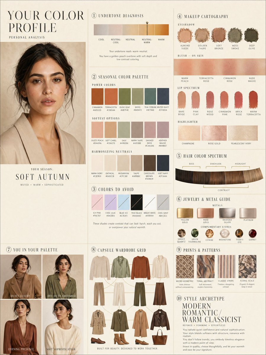
LUXURY PERSONAL COLOR PROFILE — EDITORIAL LAYOUT
Studio portrait of subject as anchor — skin retouched to luminous glass-like perfection, preserved natural structure, realistic pore texture, soft directional key lighting, no facial alteration. Background: warm ecru parchment with subtle linen grain texture. Layout reads like a Vogue Italia beauty supplement printed on heavyweight matte stock. Structured editorial grid, 3-column asymmetric, wide negative space, serif condensed display headers, all labels in spaced uppercase tracking, cohesive warm ivory/sand/ecru background system throughout all panels, ultra-photorealistic 8K, soft diffused studio lighting, flat elegant surfaces, no drop shadows.
PANELS:
① UNDERTONE DIAGNOSIS — Tonal spectrum bar from cool ash to warm amber, precision needle marker on subject's reading. Labels: Cool / Neutral-Cool / Neutral / Neutral-Warm / Warm. Fine annotation text.
② SEASONAL COLOR PALETTE — 10–12 fabric-textured swatches in subject's optimal season. Each labeled with poetic color name and HEX. Grouped: Power Colors / Softest Options / Harmonizing Neutrals.
③ COLORS TO AVOID — Desaturated row of clashing tones with fine editorial strikethrough. Clean, non-harsh presentation.
④ MAKEUP CARTOGRAPHY — Eyeshadow gradient dust swatches / blush tones fanned on skin strip / lip spectrum barely-there to bold / highlighter finishes labeled: champagne, rose gold, pearlescent ivory.
⑤ HAIR COLOR SPECTRUM — Curved gradient strip: base, dimension, highlight, contrast tones. Gold bracket indicators on best options.
⑥ JEWELRY & METAL GUIDE — Flat-lay editorial render: yellow gold, rose gold, oxidized silver, platinum finishes alongside complementary stone tones. Minimal styling.
⑦ YOU IN YOUR PALETTE — 3–4 editorial lookbook frames, subject in palette-correct outfits. Mood labels: Quiet Luxury / Off-Duty Editorial / Evening Presence.
⑧ CAPSULE WARDROBE GRID — Outfit flatlay: tops, bottoms, outerwear, shoes, bag — all palette-correct. Coordinating lines showing interchangeability. Net-a-Porter editorial aesthetic.
⑨ PRINTS & PATTERNS — 4 fabric print thumbnails: micro geometric, tonal abstract, classic stripe, floral scale. One-line styling note per print.
⑩ STYLE ARCHETYPE — Single typographic panel. Style identity title set large (e.g. "Modern Romantic / Warm Classicist"). Three defining aesthetic words. Four-line editorial wardrobe philosophy note.
RENDER SPECS: Ultra-photorealistic, 8K, editorial magazine print quality, warm neutral color grading, soft diffused studio lighting consistent across all panels, one serif display font + one fine sans-serif body font, no gradients, flat matte surfaces only.
관련 Qwen Image 프롬프트
VR Headset Exploded View Poster
Generates a high-tech exploded view diagram of a VR headset with detailed component callouts and promotional text.
Illustrated City Food Map
Generates a hand-drawn, watercolor-style tourist map featuring numbered local food specialties, landmarks, and a legend.
E-commerce Live Stream UI Mockup
Generates a realistic social media live stream interface overlaying a portrait, featuring customizable chat messages, gift popups, and a product purchase card.
Knight-Mage Battles Stone Golem
A cinematic fantasy battle scene for generating epic game-style artwork of an armored heroine fighting a giant stone golem in a ruined cathedral.
Censored Elven Adventurers in Medieval Village
Generates a cinematic fantasy scene of two detailed elven adventurers walking through a medieval village with castle backdrop and obscured faces.
Faceless Cyberpunk Infiltrator
Generates a cinematic anime scene of an armed faceless woman infiltrating a high-security futuristic server room.