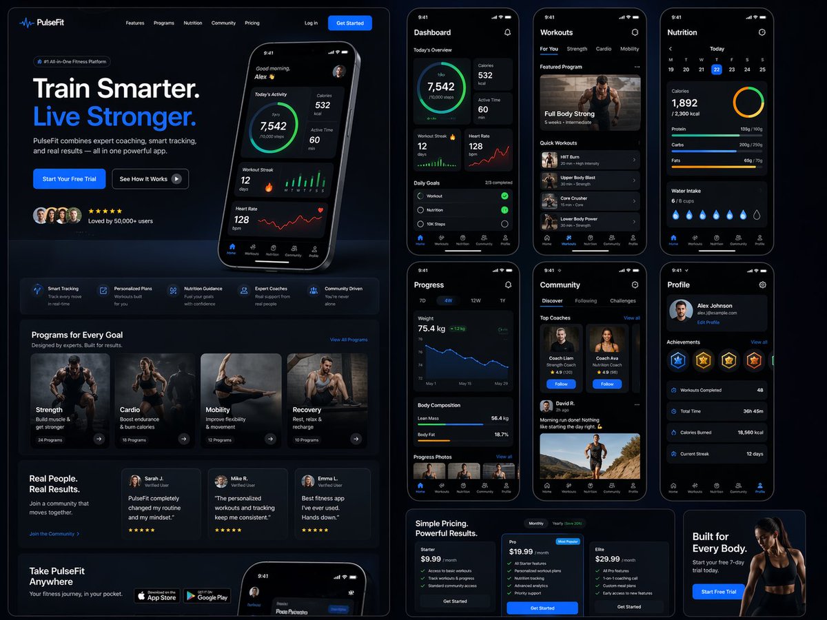
Fitness SaaS Landing Page UI
A massive, detailed prompt for generating a complete web and mobile UI/UX design for a premium fitness brand, including dashboards and various interface sections.
商品写真、パッケージ、ブランド広告の初稿作りに向いています。主体、素材、背景、商業レタッチの方向があるので、変数を差し替えるだけで試せます。
推奨比率
4:5 または 3:4
品質の進め方
高精細で仕上げる
生成フロー
まずテキストで主画面を作り、一度に一つの重要な要素だけ修正します。
Qwen Image 完全プロンプト
English prompt
Design a modern, high-end {argument name="app type" default="fitness app"} landing page and product UI for a brand called {argument name="brand name" default="PulseFit"}.

Create a clean web design mockup that looks like a real SaaS fitness platform and mobile companion app. The design should feel premium, motivating, and easy to use, with a polished UI/UX style similar to top-tier health and wellness apps.

Include:
- A hero section with bold headline, short subheadline, strong call-to-action button, and app preview
- Dashboard UI showing daily activity, calories burned, workout streak, heart rate, step count, and progress rings
- Workout program cards for strength, cardio, mobility, and recovery
- Nutrition tracking section with macro breakdown and water intake
- Progress charts and analytics widgets
- Trainer/community section with profile cards and testimonials
- Pricing section and download/app store callout
- Mobile app screens shown alongside the web design for a cohesive product ecosystem

Style direction:
- Sleek, minimal, modern interface
- Premium fitness brand aesthetic
- Smooth spacing, strong hierarchy, rounded cards, soft shadows
- Dark mode UI with energetic accent colors like electric blue, neon green, or vibrant orange
- Crisp typography, realistic charts, polished buttons, beautiful onboarding feel
- Highly detailed, dribbble-worthy, startup-quality product design
- Realistic UX case study presentation, not a cartoon or illustration

Composition:
- Full website homepage mockup
- Multiple UI sections visible in one polished presentation
- Slight perspective or straight-on product showcase
- Clean background with subtle gradients and professional lighting
- Ultra-detailed, sharp text rendering, visually balanced layout

Output:
A stunning, realistic UI/UX design concept for a fitness app website and dashboard that looks ready for development.

Make it look like a real Figma product design presentation for a premium startup.関連するQwen Imageプロンプト
VR Headset Exploded View Poster
Generates a high-tech exploded view diagram of a VR headset with detailed component callouts and promotional text.
E-commerce Live Stream UI Mockup
Generates a realistic social media live stream interface overlaying a portrait, featuring customizable chat messages, gift popups, and a product purchase card.
Pancake Angel Cafe Cover
Generates a dreamy watercolor anime cover of a winged cafe angel serving honey pancakes in a sunlit morning cafe.
Summer Grape Girl 3x3 Grid Portrait
A comprehensive prompt for creating a 3x3 photo grid of a summer-themed 'Grape Girl' with specific instructions for consistency and style.
Mystical Japanese AI Face Reading Report
Generates an ornate Japanese fortune-telling appraisal sheet with a celestial portrait, moonlit gold layout, and multiple readable report sections.
Miniature City Tiny Worlds
A macro photography prompt creating a realistic miniature city built within human hair, featuring high detail and natural skin textures.